Make a Depth-Effect Wallpaper with Text
The best lock screens look like album covers: a subject, a word floating behind them, depth you can feel through the glass. You'll see this wallpaper a hundred times a day — worth ten minutes to make it yours.
The recipe
- Choose a portrait photo with the subject in the lower two-thirds — you, your dog, a mountain, a car. Space above the subject is where words (and the clock) will live.
- Import into LayeredText. The on-device AI finds the subject; your text will automatically tuck behind it.
- Go big and short. One word — a name, a mantra, a year — at display size. Wallpapers are seen at arm's length through a glance; bold display fonts (Anton, Archivo Black, Bungee) or a preset like Midnight or Neon hold up best.
- Place for the overlap. Slide the word down until the subject's head or shoulder covers part of it — that occlusion is the whole depth effect. Keep the covered part under a third of the word.
- Save to Photos, then long-press your lock screen → + → pick the image. Done: custom depth wallpaper.
Designing around the clock
The lock screen stacks its own UI on your art: the clock sits high, widgets under it, the flashlight and camera at the bottom. Practical implications:
- Don't put your text where the clock is — the upper-center band. Either place words at the subject's chest height, or off to a side the clock doesn't touch.
- Preview before committing: set the wallpaper, glance, adjust. Because LayeredText keeps the project editable, nudging the word two centimeters down is a 30-second round trip.
- Bonus depth: if your photo's subject reaches high enough, iOS's own depth effect will slide the clock behind them too — system clock behind subject, your text behind subject, three layers of depth from one photo.
Style notes for all-day viewing
- Contrast beats color: white or near-white text with a shadow survives every lighting condition; neon colors look great at night and washed out at noon.
- Opacity is elegance: dropping the text layer to 70–85% opacity makes it feel printed into the scene rather than stickered on.
- Resist the sentence. The wallpapers that stay good for months are a single word you still believe in — not a quote you'll be tired of by Friday.
Make a set: since projects stay editable, build one design and clone the idea across seasons — same word, new photo; same photo, new preset. Your lock screen gets a wardrobe instead of an outfit.
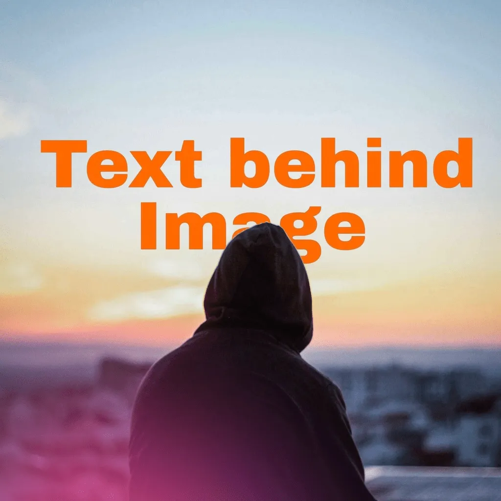
A lock screen worth the glances
Photo in, word behind, wallpaper out. Free to try on iPhone.
FAQ
How do I set my design as a wallpaper?
Save to Photos, long-press the lock screen, + , choose the image. The depth is baked in.
What's the best photo orientation?
Portrait, subject low, calm space up top for the clock.
Will iOS's own depth effect interact with my text?
They stack happily — system clock behind subject, your text behind subject, extra depth for free.