Choosing Fonts for Photo Text
The font is the design. Same photo, same word: set it in Anton and it's a poster; in Caveat and it's a journal; in Orbitron and it's a sci-fi cover. Seventy-five options is freedom — here's the map.
The four families that matter
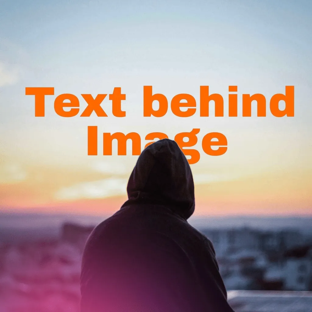
- Display heavies: Anton, Archivo Black, Bungee, Black Ops One, League Spartan, Titan One: built for one huge word. This is the text-behind-subject workhorse class, because bold letterforms survive being partially covered.
- Scripts & handwriting: Pacifico, Dancing Script, Caveat, Kaushan Script, Sacramento, Permanent Marker: warmth, motion, personality. Best as the small layer in a pair, or solo on calm photos (the “create” over the chef).
- Elegant serifs: Playfair Display, Bodoni Moda, Libre Baskerville, Prata, Vollkorn: editorial and expensive-looking. They want size and gentle overlap. Thin strokes disappear if the subject eats too much.
- Character faces: Orbitron and Exo 2 (techno), Silkscreen (pixel), Special Elite (typewriter), Rubik Bubbles and Amatic SC (playful): instant genre. Use when the photo's story matches the font's costume.
The 39 presets, decoded
Each preset sets font, size, color, case, alignment and shadow in one tap: a full art direction, not just a font. Rough mood map: Classic, Elegant, Minimal, Luxury for editorial restraint; Bold, Dramatic, Urban, Electric for posters; Neon, Techno, Cosmic, Midnight for night shots; Romantic, Handwritten, Pastel, Lavender for soft scenes; Vintage, Retro, Art Deco, Grunge for period flavor; and a seasonal shelf — Sunset, Beachy, Tropical, Autumn, Summery — that matches golden-hour and travel photos. Apply the closest one, then tweak the single property that's off; that's faster than building from scratch and teaches the combinations as you go.
Pairing rules (steal these)
- Two fonts, maximum contrast: a heavy display headline + a light script accent. Two similar fonts read as a mistake; two opposite ones read as a choice.
- Size gap of 3× or more between the big word and the supporting line. Hierarchy needs daylight. (Layer mechanics in the layering guide.)
- Match stroke to background noise: busy background → heavier font and a shadow; clean sky → anything goes, even thin serifs.
- Case is a style tool: ALL-CAPS display feels like a shout, lowercase script like a whisper, and the case toggle changes the sentence's voice without changing the words.
The 10-second audition: since every layer re-styles live, flip through five candidate fonts on the actual photo before deciding. Fonts audition differently on a real image than in a picker list — always cast on set.
75 fonts, zero font-buying
Every family above ships in the app. Free to try on iPhone.
FAQ
What's the best font for text behind a subject?
Heavy display faces: they stay legible when the subject covers part of the word.
What do the style presets actually change?
The whole combination: font, size, color, case, alignment and shadow. One tap, then tweak.
Can I use different fonts in one design?
Yes, per layer: pair a display headline with a script accent, and stop at two.