Covers & Thumbnails with Text Behind the Subject
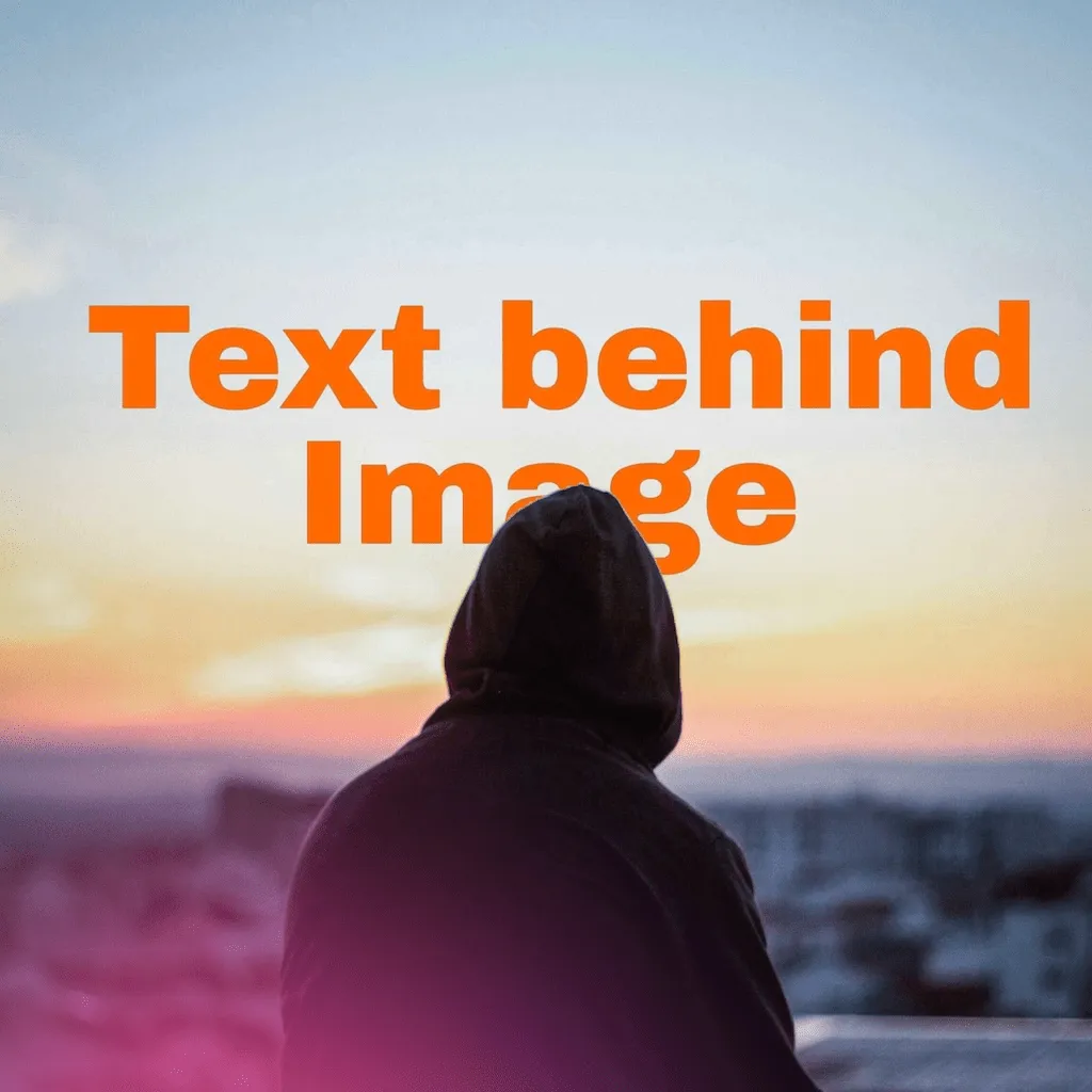
A cover has one job: make the thumb stop. Flat caption text doesn't do it — the feed is wallpapered with it. Text that dips behind the subject reads as designed, and designed is what earns the pause.
Why the depth trick converts
Occluded type is what magazine covers, movie posters and album art have in common — it's a production-value signal the eye recognizes in a tenth of a second. When your Reels cover or carousel opener uses the same grammar, it borrows that authority. The mechanics are in the core guide; here's the feed-specific craft.
The thumbnail rules
- Two words, maximum. Covers display at postage-stamp size in grids and story trays. “EPISODE 12” reads; a sentence doesn't.
- Heavyweight fonts only. Anton, Archivo Black, Bungee, League Spartan — display faces built for shouting. Scripts are for accents, not titles.
- Contrast is non-negotiable: light text on dark zones, dark on light, shadow when the background argues. The Bold, Dramatic and Midnight presets are pre-tuned for this.
- Protect the letters that matter. Let the subject bite the bottom or a corner of the title — never mid-word. Readable-but-overlapped is the target.
- The 20% test: after saving, zoom the image way out in Photos. If the title still reads, ship it; if not, bigger font, fewer words.
Per-format notes
- Reels/TikTok covers: design in portrait, keep the title in the upper two-thirds — platform UI (handles, captions) eats the bottom.
- Instagram grid: the grid crops to square previews — keep the word near the frame's center so both crops survive.
- YouTube thumbnails: landscape source photo, subject on one side, title on the other with the overlap at their shoulder; watch the bottom-right corner where the duration badge sits.
- Series consistency: reopen last episode's project, swap photo and word, keep everything else — same layer recipe, instant brand.
Creator's aside: everything renders on-device, so the turnaround is genuinely phone-speed — shoot, effect, post from the same device in minutes, with no upload step in the middle.
Covers that earn the pause
Depth-effect titles in minutes, on your phone. Free to try.
FAQ
Why do text-behind-subject covers perform well?
Occlusion reads as produced, not pasted — and production value is what stops thumbs.
How do I keep the title readable at thumbnail size?
Two words, heavyweight font, high contrast, overlap at the edges — then the 20% zoom test.
Can I reuse a design for a series?
Yes — reopen the project, swap photo and word, keep the recipe.